
A Recipe for an Accessible Accordion Block
What we'll be covering
- What is an accordion?
- The Accessible Accordion Rubric
- Block Code walkthrough
What is an accordion?
An accordion is a set of collapsible panels that can be used to hide and show content.
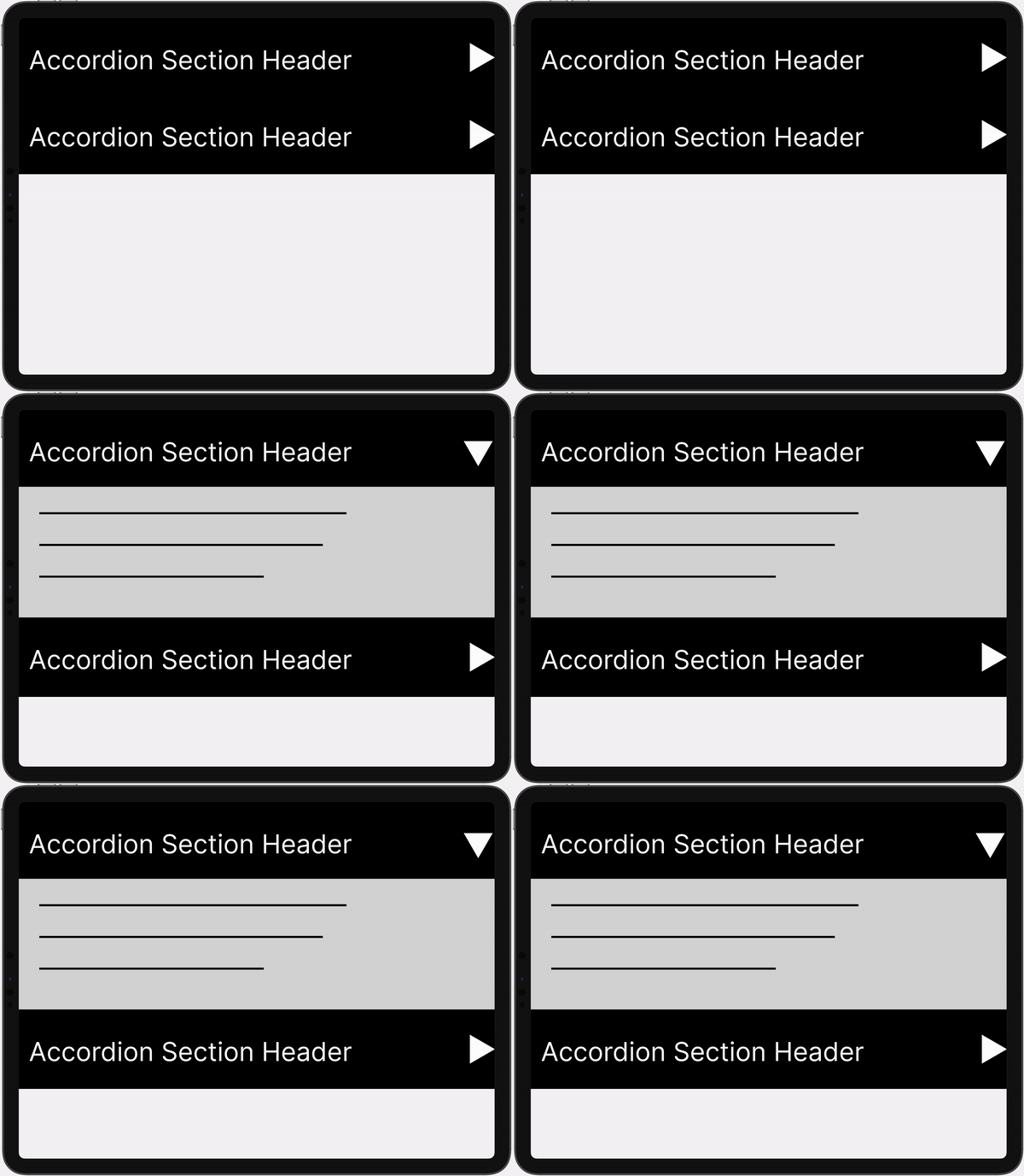
What about the details element?
Is this an accordion?
Nope! A semantic accordion doesn't exist yet.
This is another details element.
I operate independently of any other details element on the page.
The Accessible Accordion Rubric
There are 4 main criteria for an accessible accordion.
-
Keyboard operable
Can you navigate between the accordion sections and their panels with your keyboard?
-
Assistive device accessible and navigable
Can screen readers and other assistive devices navigate and communicate the list of accordion sections available?
-
Responsive
Does the accordion function well regardless of screen size?
-
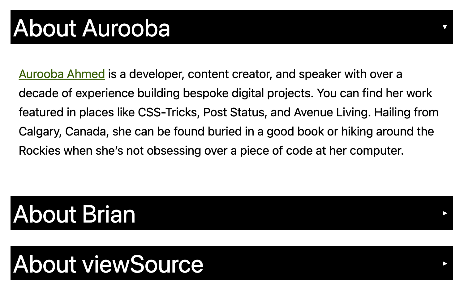
Visually Styled as an Accordion
Does the accordion visually indicate collapsed content and suggest how to collapse expanded content?
What does an accessible accordion look like?
The HTML
Accordion Block

Accordion Section Markup
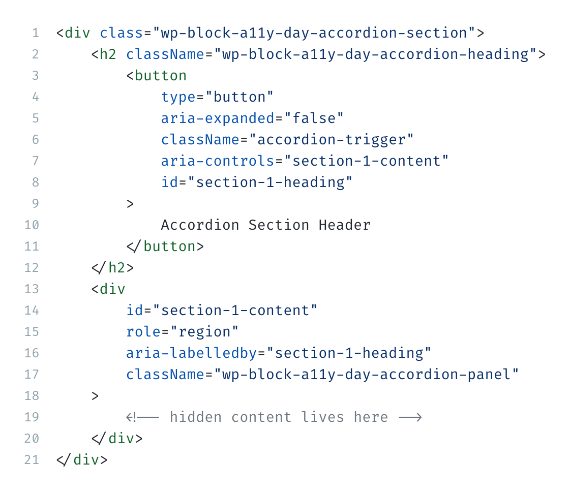
								<div class="wp-block-a11y-day-accordion-section">
								<h2 className="wp-block-a11y-day-accordion-heading">
									<button
										type="button"
										aria-expanded="false"
										className="accordion-trigger"
										aria-controls="section-1-content"
										id="section-1-heading"
									>
										Accordion Section Header
									</button>
								</h2>
								<div
									id="section-1-content"
									role="region"
									aria-labelledby="section-1-heading"
									className="wp-block-a11y-day-accordion-panel"
								>
									<!-- hidden content lives here -->
								</div>
							</div>
The JavaScript
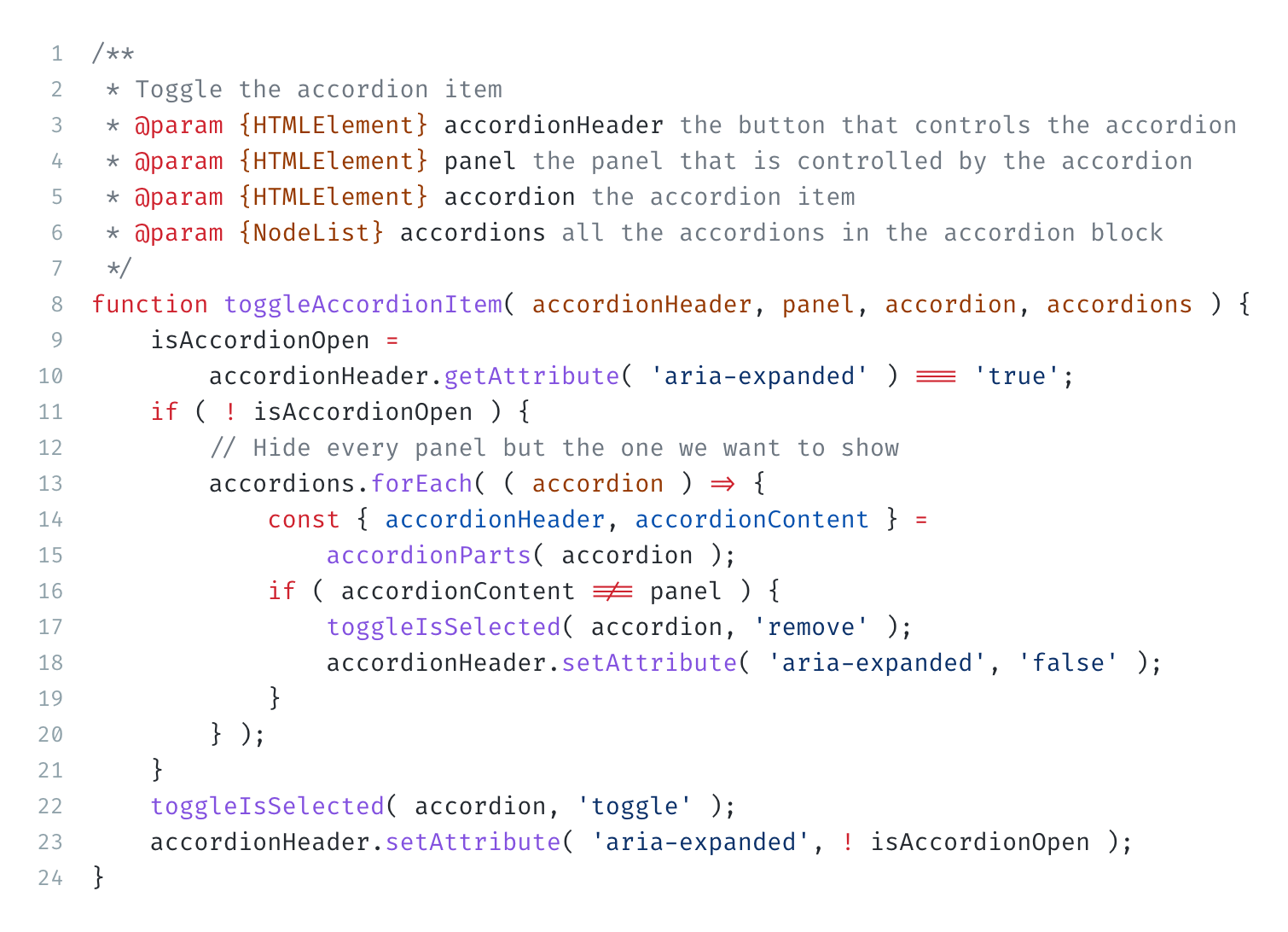
View the complete JavaScript code here.
					/**
					* Toggle the accordion item
					* @param {HTMLElement} accordionHeader the button that controls the accordion
					* @param {HTMLElement} panel the panel that is controlled by the accordion
					* @param {HTMLElement} accordion the accordion item
					* @param {NodeList} accordions all the accordions in the accordion block
					*/
					function toggleAccordionItem( accordionHeader, panel, accordion, accordions ) {
						isAccordionOpen =
							accordionHeader.getAttribute( 'aria-expanded' ) === 'true';
						if ( ! isAccordionOpen ) {
							// Hide every panel but the one we want to show
							accordions.forEach( ( accordion ) => {
								const { accordionHeader, accordionContent } =
									accordionParts( accordion );
								if ( accordionContent !== panel ) {
									toggleIsSelected( accordion, 'remove' );
									accordionHeader.setAttribute( 'aria-expanded', 'false' );
								}
							} );
						}
						toggleIsSelected( accordion, 'toggle' );
						accordionHeader.setAttribute( 'aria-expanded', ! isAccordionOpen );
					}
The CSS
View the complete styles hereHeader styles
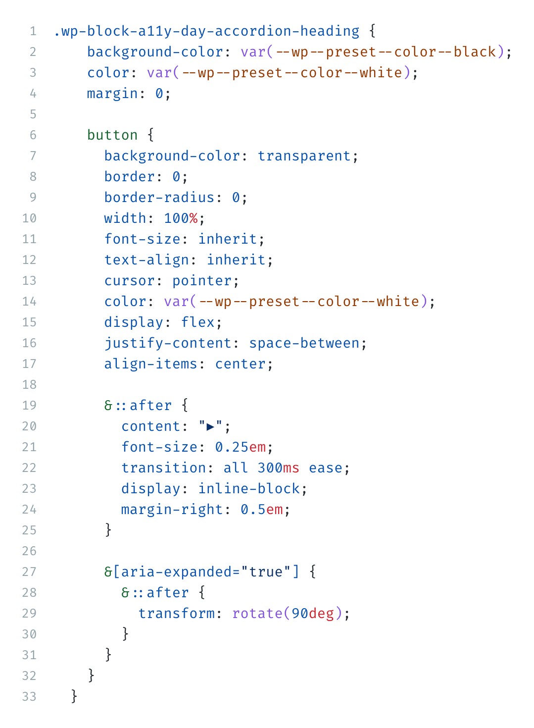
							.wp-block-a11y-day-accordion-heading {
										background-color: var(--wp--preset--color--black);
										color: var(--wp--preset--color--white);
										margin: 0;

										button {
											background-color: transparent;
											border: 0;
											border-radius: 0;
											width: 100%;
											font-size: inherit;
											text-align: inherit;
											cursor: pointer;
											color: var(--wp--preset--color--white);
											display: flex;
											justify-content: space-between;
											align-items: center;

											&::after {
												content: "▶";
												font-size: 0.25em;
												transition: all 300ms ease;
												display: inline-block;
												margin-right: 0.5em;
											}

											&[aria-expanded="true"] {
												&::after {
													transform: rotate(90deg);
												}
											}
										}
									}
Panel styles
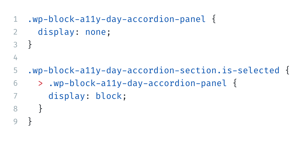
							.wp-block-a11y-day-accordion-panel {
								padding: calc(var(--wp--style--block-gap) / 2);
								display: none;
								transition: opacity 0.3s ease-in;
							  }

							  .wp-block-a11y-day-accordion-section.is-selected {
								> .wp-block-a11y-day-accordion-panel {
								  display: block;
								}
							  }
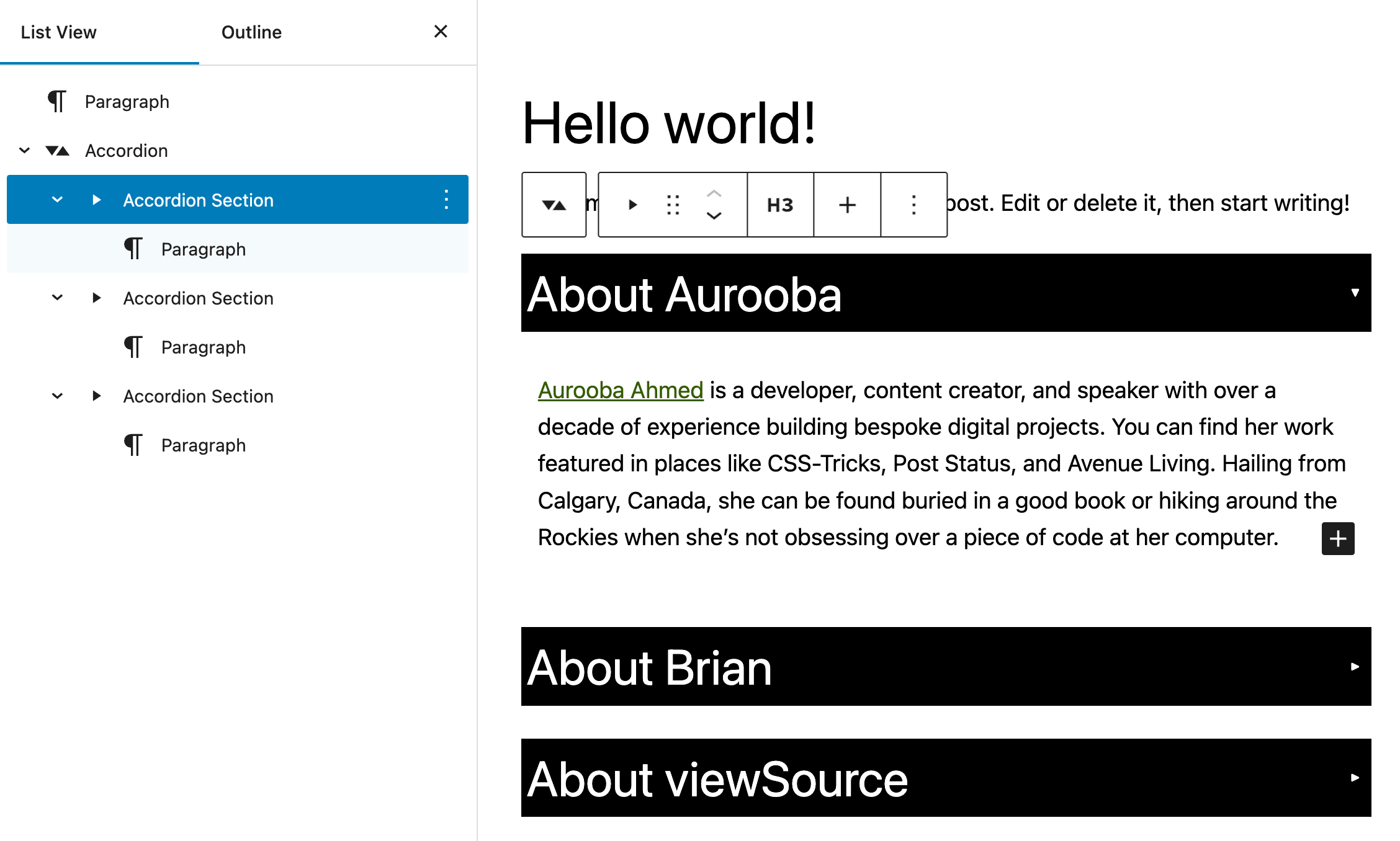
What does an accessible accordion block editing experience look like?
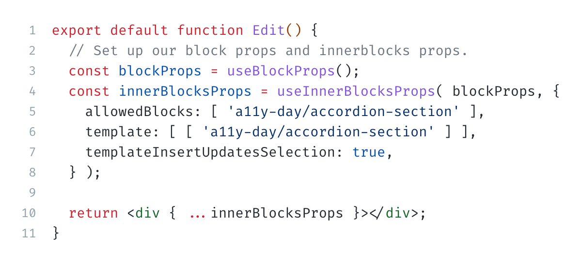
The Block Structure
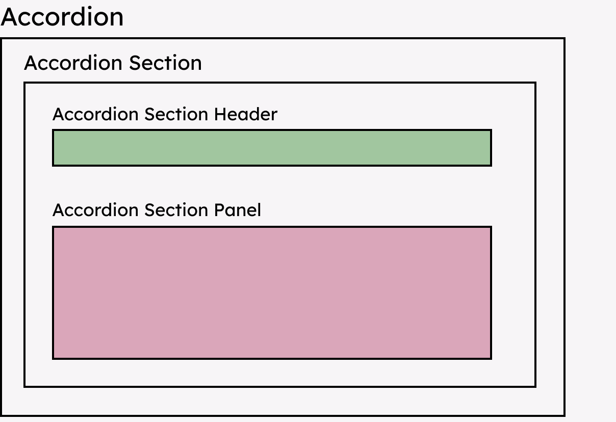
How does an accessible accordion block function in the editor?
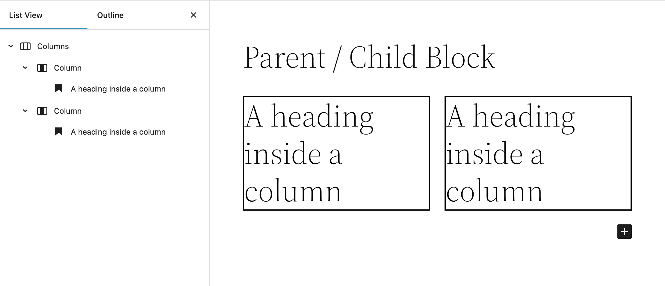
Registering the parent and child blocks
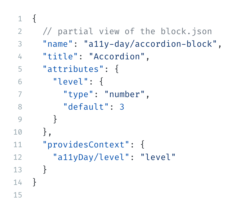
Registering the parent block
						{
							// partial view of the block.json
							"name": "a11y-day/accordion-block",
							"title": "Accordion",
							"attributes": {
							  "level": {
								"type": "number",
								"default": 3
							  }
							},
							"providesContext": {
							  "a11yDay/level": "level"
							}
						  }
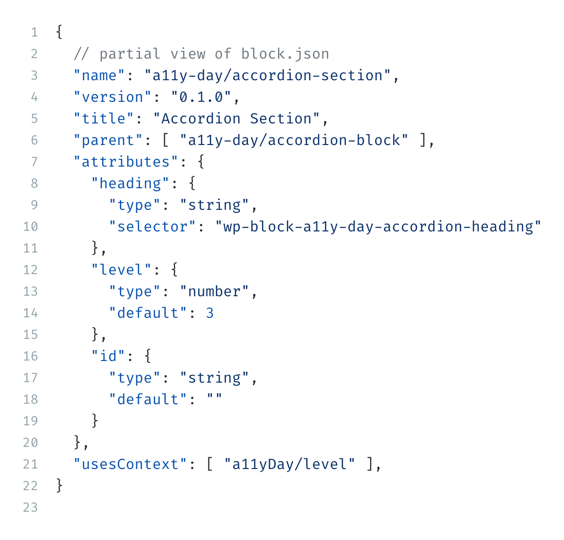
Registering the child block
							{
								// partial view of the block.json
								"name": "a11y-day/accordion-section",
								"title": "Accordion Section",
								"parent": [ "a11y-day/accordion-block" ],
								"attributes": {
								  "heading": {
									"type": "string",
									"selector": "wp-block-a11y-day-accordion-heading"
								  },
								  "level": {
									"type": "number",
									"default": 3
								  },
								  "id": {
									"type": "string",
									"default": ""
								  }
								},
								"usesContext": [ "a11yDay/level" ]
							  }
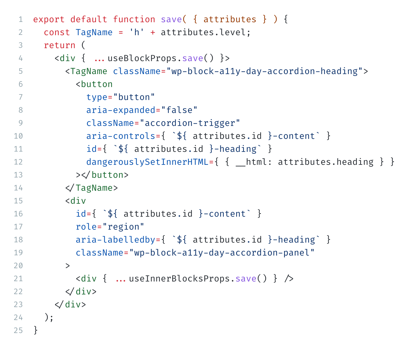
							export default function save( { attributes } ) {
									const TagName = 'h' + attributes.level;
									return (
										<div { ...useBlockProps.save() }>
											<TagName className="wp-block-a11y-day-accordion-heading">
												<button
													type="button"
													aria-expanded="false"
													className="accordion-trigger"
													aria-controls={ `${ attributes.id }-content` }
													id={ `${ attributes.id }-heading` }
													dangerouslySetInnerHTML={ { __html: attributes.heading } }
												></button>
											</TagName>
											<div
												id={ `${ attributes.id }-content` }
												role="region"
												aria-labelledby={ `${ attributes.id }-heading` }
												className="wp-block-a11y-day-accordion-panel"
											>
												<div { ...useInnerBlocksProps.save() } />
											</div>
										</div>
									);
								}
Editor Accessibility Tweaks
Listen for the global Add Block keyboard shortcut when the RichText
component is focussed.

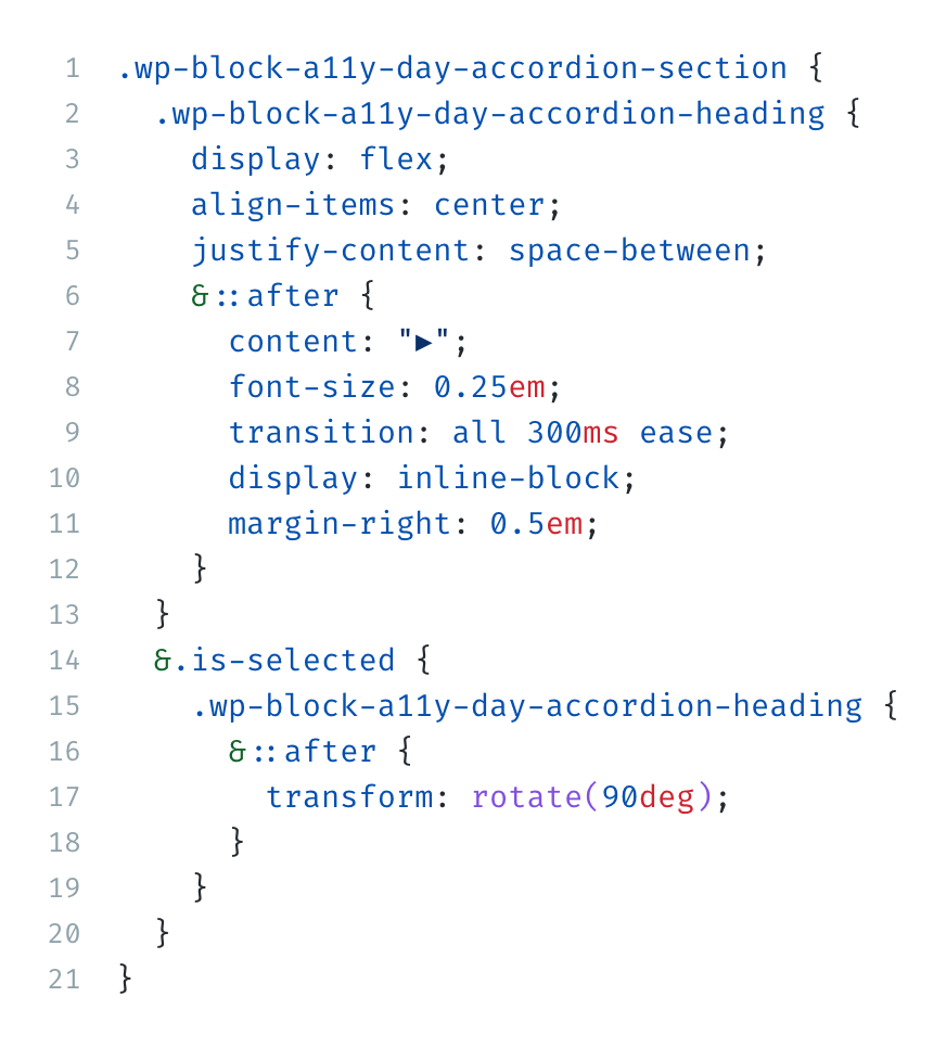
Editor CSS
Apply the button styles and toggle animation to the heading div
					.wp-block-a11y-day-accordion-section {
							.wp-block-a11y-day-accordion-heading {
								display: flex;
								align-items: center;
								justify-content: space-between;
								&::after {
									content: "▶";
									font-size: 0.25em;
									transition: all 300ms ease;
									display: inline-block;
									margin-right: 0.5em;
								}
							}
							&.is-selected {
								.wp-block-a11y-day-accordion-heading {
									&::after {
										transform: rotate(90deg);
									}
								}
							}
						}
Accordion accessibility is important
Thank you!
-
Try out the block yourself:
https://aurooba.com/a11y-day-sandbox -
View the code:
https://github.com/bacoords/a11y-day-accordion-block -
View the slides:
https://bacoords.github.io/a11y-day-accordion-block/presentation.html